

Mobile-friendly medical websites 2025: Essential for Success
The Digital Front Door: Why Mobile-Friendly Medical Websites are Crucial for Your Practice
Why is a mobile-friendly medical website essential for healthcare practices today?
- Patient Access: Over 70% of patients use their phones to find medical information and services.
- User Expectation: A remarkable 83% of mobile users expect an excellent website experience.
- SEO Advantage: Google prioritizes mobile-friendly sites, impacting search rankings and visibility.
- Conversions: 70% of mobile-based searches show robust intent for immediate action, like booking an appointment.
- Avoid Patient Loss: Failing to meet mobile user expectations can cause a 40% shift to a competitor’s platform.
Mobile-friendly medical websites are no longer a luxury but a core necessity. Your website is often the first impression a potential patient has of your practice. With most web traffic coming from mobile devices, a clunky, slow, or difficult-to-steer mobile site can push patients away before they even call.
As digital marketing experts, we’ve seen the transformative power of a well-optimized online presence. This guide will help you understand the vital role a mobile-friendly presence plays in your practice’s success.
Mobile-friendly medical websites terminology:
The Diagnosis: Why a Mobile-Friendly Website is Non-Negotiable
Imagine your practice’s front door is stuck. That’s how a non-mobile-friendly website feels to patients. Your website is your digital front door, and with 92.3% of internet users online via mobile, it’s essential it works flawlessly. Over 60% of healthcare searches happen on mobile devices.
This shift to mobile makes a mobile-friendly medical website essential for patient acquisition. If your site isn’t optimized for phones, you’re turning away a massive audience. Patients expect instant access to information. If they can’t quickly find services or book an appointment, 40% will shift to a competitor after a poor mobile experience.
A mobile-friendly site is about credibility and patient trust. These digital first impressions count. A well-designed, responsive website shows your practice is modern, professional, and cares about patient needs. In contrast, a clunky mobile site can add to patient stress and make your practice seem less expert.
The Impact on SEO and Online Visibility
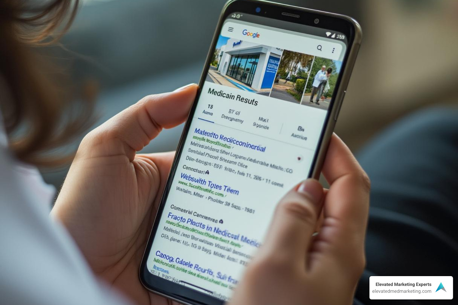
Google is a huge fan of mobile-friendly medical websites. With Google’s mobile-first indexing, Google primarily judges your website based on its mobile version for search rankings. If your mobile site is poor, your entire search engine visibility suffers, even with a perfect desktop site.
Google prioritizes mobile-friendly sites to ensure a good user experience. A slow or difficult-to-use mobile site is a poor user experience signal, hurting your rankings. Since July 2018, website loading speed has been a key ranking factor, making a speedy mobile site critical for SEO. These user experience signals tell Google if visitors are having a good time on your site.
Local SEO is also crucial. Patients often search for “plastic surgeon near me” on their phones. A strong, mobile-friendly site helps your practice appear in these local search queries. With the rise of voice search on mobile devices, a well-optimized site is key to being found through spoken queries. At Liftd Marketing Experts, we build websites with clean structures, optimized URLs, and fast speeds to improve SEO from day one. Learn more in our guide on Plastic Surgery Website SEO.
Building Patient Trust from the First Tap
Your website is like a digital handshake. That first tap is critical. A slow or clunky mobile site can lose patients instantly. People form an opinion of a website in just 50 milliseconds, and 46.1% of consumers judge a site’s credibility on its visual design, including layout, typography, and color choices.
An unprofessional or difficult-to-use mobile site erodes trust. We work to lift the user experience, ensuring your site is functional, beautiful, and reassuring.
Security perception is also a huge factor in healthcare. Patients are concerned about their data security online. Using secure online forms with SSL encryption and ensuring HIPAA compliance builds immense trust. Show patients you take their data security seriously to assure them they’re in safe hands.
Clear communication is key. Use simple language, make navigation easy, and ensure contact information is easy to find. Since 94% of patients check online reviews, adding testimonials boosts credibility. Your website should be a clear, straightforward experience. For inspiration, explore some professional medical website design ideas.
Anatomy of Effective Mobile-Friendly Medical Websites
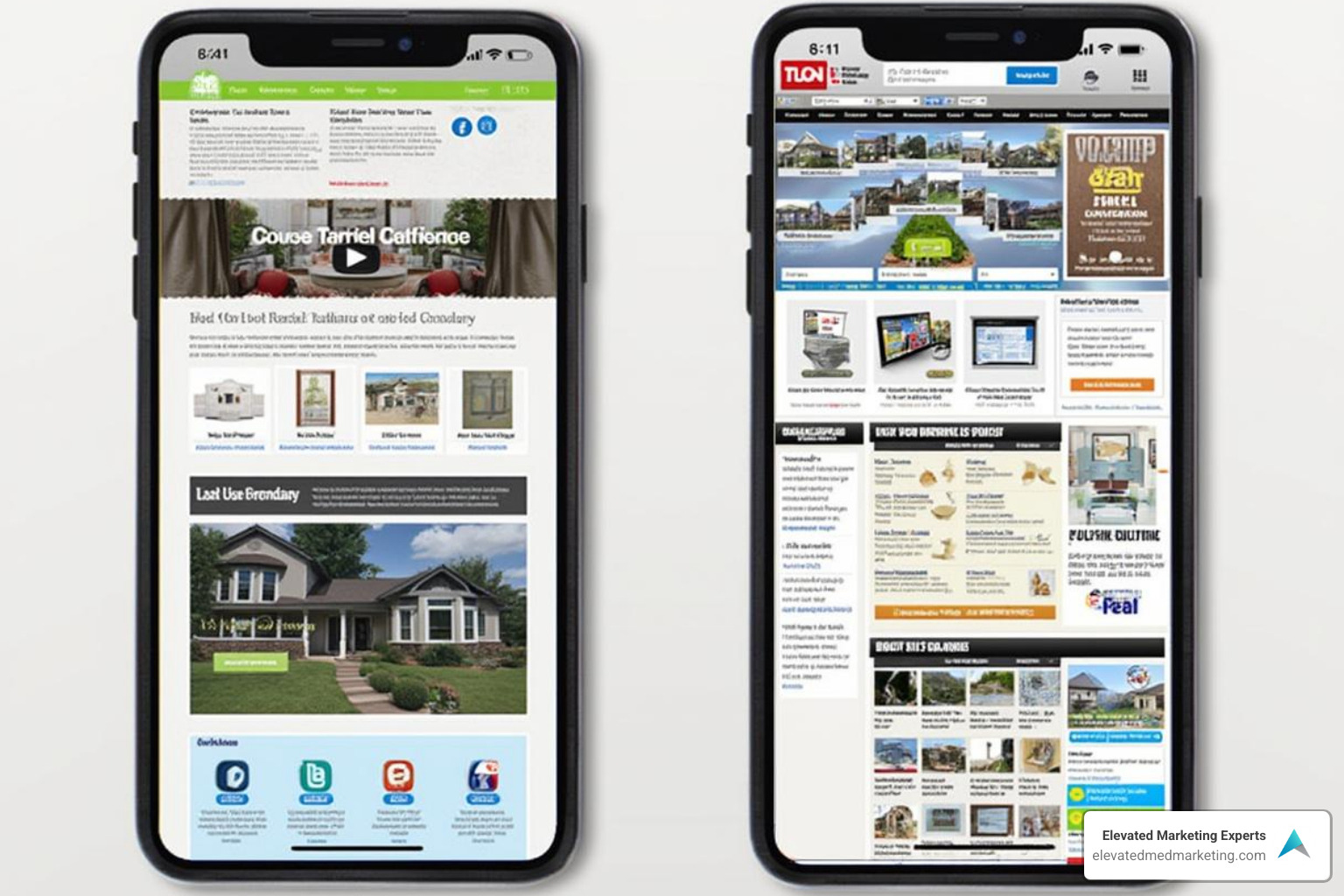
What makes a mobile-friendly medical website effective? It’s more than shrinking your desktop site; it’s about designing for mobile users’ specific needs. The key is responsive web design, which allows your site to adapt its layout to any screen size, from smartphones to desktops, eliminating awkward zooming or scrolling.
Beyond responsiveness, a smart user interface (UI) is crucial for touchscreens. This includes readable text (an ideal font size of 16 pixels on mobile) with high contrast. At Liftd Marketing Experts, we create sites that are not just responsive but truly optimized for a fantastic mobile experience. Dive deeper into design with our guide on The Art of Plastic Surgery Website Design: A Comprehensive Guide.
Core Design Principles for Mobile Success
When Liftd Marketing Experts designs mobile-friendly medical websites for plastic surgeons and med spas, we follow a few golden rules:
- Responsive Layout: Your website must automatically adjust its layout, images, and text to fit any screen size, ensuring no horizontal scrolling.
- Readable Typography: On small screens, clear text is vital. We use clean fonts (at least 16px for body text) with good spacing and high contrast to reduce eye strain.
- Soothing Color Palettes: In healthcare, colors matter. We suggest calm colors like blues and greens to create a professional, welcoming feel. (Learn more about color psychology here).
- High-Quality Imagery: We use high-quality photos of your team and office, not generic stock photos. We also ensure images load quickly and don’t obstruct important information.
- Intuitive Navigation: Mobile users need simple navigation. We design clear menus, often using the “hamburger” icon, and use sticky navigation bars that remain visible while scrolling for easy access to key sections. (Read why sticky navigation is effective here).
- Touch-Friendly Buttons: We ensure all buttons and links are large enough to be easily tapped with a finger, preventing frustrating accidental clicks.
Essential Features for Patient Engagement
An effective mobile-friendly medical website needs features that encourage patients to connect and book appointments. For aesthetic and wellness practices, these are the game-changers:
- Click-to-Call Buttons: One tap, and patients can call your office directly from their phone.
- Embedded Maps with Directions: A map that guides patients to your door with a “Get Directions” option is incredibly helpful.
- Online Appointment Scheduling: Patients expect to book appointments from their smartphones 24/7. A user-friendly mobile scheduling system reduces frustration and no-shows with automatic reminders.
- Patient Portal Access: Ensure smooth mobile access for patients to check lab results, appointment details, or medication history.
- Testimonials and Reviews: Since 94% of patients check online reviews, integrating positive experiences on your site is powerful.
- Secure Online Forms: Mobile-optimized, HIPAA-compliant forms are essential to protect patient data and streamline administrative tasks.
- Telemedicine Support: Make it easy for patients to connect with providers for virtual care from their mobile devices.
- Patient Education and Multimedia Content: Engage patients with videos, infographics, and a helpful blog to share updates and showcase your expertise.
When these features are integrated into a well-designed, mobile-friendly medical website, your online presence becomes a powerful tool for attracting and engaging patients.
Improving the Patient Journey with UX and Accessibility
At Liftd Marketing Experts, our goal is to create a digital experience as welcoming as your physical practice. Your website should be an intuitive, stress-free extension of your waiting room. This means prioritizing user experience (UX) and digital accessibility on mobile devices. A smooth online patient journey builds trust, encourages engagement, and leads to more conversions. For more insights, see our guide on Why Professional Website Design is Essential for Medical Spas.
How Mobile Optimization Improves User Experience
Have you ever tried booking an appointment on a phone with tiny text, impossible-to-tap buttons, or slow-loading images? It’s incredibly frustrating. This is the reality for patients on a non-mobile-friendly medical website. When your site isn’t optimized, it creates a barrier instead of a bridge.
Mobile optimization directly improves this experience. It ensures fast load times, which is critical as mobile users are impatient. One out of four visitors will abandon a page if it takes more than 4 seconds to load. We optimize images, code, and server responses to ensure your site is lightning-fast, keeping potential patients engaged.
This speed, combined with intuitive design, significantly reduces bounce rates. When your mobile-friendly medical website loads quickly and is easy to use, visitors are more likely to stay and convert. We focus on a simplified user flow, streamlining content and navigation. This means presenting information clearly and logically, so patients can find what they need without endless scrolling. Critical information like contact details and services should have easy information access. A smart mobile content strategy uses concise language, bullet points, and engaging visuals, allowing patients to quickly scan for information.
Why Digital Accessibility is Crucial for Mobile Healthcare Websites
Digital accessibility is a fundamental requirement, legally (like ADA compliance) and ethically. A truly mobile-friendly medical website must be usable by everyone, regardless of their abilities. This includes individuals using screen readers for visual impairments, keyboard navigation for motor impairments, or those who benefit from clear layouts due to cognitive disabilities.
The COVID-19 pandemic highlighted accessibility issues in digital health. As mobile devices became the primary way to seek medical advice, the need for universally designed platforms became more urgent. Ensuring your website is accessible for all users, including older adults, helps close a critical digital health technology gap.
Ensuring your site is accessible promotes inclusivity, making vital health information available to everyone. We follow the Web Content Accessibility Guidelines (WCAG) to ensure sufficient contrast, descriptive alt text for images, and keyboard-friendly navigation. Prioritizing accessibility also helps in building community trust. A practice that shows it cares about making its online resources available to all demonstrates a deep commitment to patient care, fostering trust and improving your reputation.
We strongly advocate for optimizing healthcare sites for mobile users as a vital form of digital accessibility. This should be a top priority for every practice. For comprehensive resources, we recommend exploring WebAIM accessibility resources.
Your Practice’s Health Check: Assessing and Improving Mobile Performance
Now, let’s get practical. How do you know if your mobile-friendly medical website is performing well? Think of it as a regular check-up for your site. You need to constantly monitor and fine-tune its performance for mobile visitors. It’s about ensuring everything works smoothly, not just looking good. Our Website Design and Development Services can guide you through this process.
Common Challenges and How to Address Them
Maintaining mobile-friendly medical websites can be challenging. Here are common issues and how to address them:
- Technical Limitations and Outdated Technology: Many practices have sites built on outdated technology not optimized for mobile speed or design. The best solution is often a complete redesign with a mobile-first approach. Partnering with a web agency specializing in healthcare is key.
- Budget Constraints: Quality web design is an investment. But consider the cost of a poor mobile experience, which can cause 40% of patients to shift to a competitor. A new website is an investment in future growth, preventing a far greater loss in appointments.
- HIPAA Compliance and Security: Keeping patient data safe on mobile is complex, and many developers don’t understand HIPAA basics. Always work with agencies experienced in healthcare web development. They’ll implement robust security like SSL encryption, secure servers, and regular updates. Transparency about data protection builds trust.
- Content Management: Keeping mobile content fresh and accurate can be tricky. A modern Content Management System (CMS) makes it easy for your team to update your website without needing coding skills, keeping content current and engaging.
- Lack of Specialized Expertise: General web developers may not understand the unique patient experience or strict regulatory compliance needed for healthcare sites. They might overlook crucial features like easy appointment forms. Partnering with specialists like us at Liftd Digital Marketing is crucial. We have the industry experience to build sites that are functional, compliant, and designed to convert patients for aesthetic and wellness practices.
How to Assess and Improve Your Website’s Mobile Performance
Here’s how you can regularly check your website’s mobile performance:
- Google’s Mobile-Friendly Test: This free Google tool is a quick health check. Enter your website’s address, and it will instantly tell you if your page is mobile-friendly and point out any major loading issues.
- PageSpeed Insights Analysis: This free Google tool goes deeper, analyzing your site’s loading speed and Core Web Vitals for both desktop and mobile. Speed is a huge ranking factor, and this tool provides actionable tips to make your site faster.
- Manual Testing: Test your website on your own phone and other devices. Is the text readable without zooming? Are buttons easy to tap? Do forms work? Can you book an appointment easily? You’d be surprised what you find.
- User Feedback: Ask your patients about their mobile experience. Their real-world insights can uncover issues that automated tools might miss. They are your most important critics.
- Review Your Analytics: Use tools like Google Analytics to review mobile bounce rates, time on page, and conversion rates. If mobile bounce rates are high or conversions are low compared to desktop, it’s a clear sign something needs fixing. This data is your secret weapon for making smart improvements.
By regularly performing these checks, you’ll ensure your website is a powerful asset that attracts new patients.
Conclusion: Your Prescription for a Thriving Digital Presence
The question is no longer if your medical website should be mobile-friendly, but how effective your mobile site is right now. A mobile-friendly medical website is the foundation for attracting new patients, engaging current ones, and building lasting relationships.
We’ve explored how a well-tuned mobile presence boosts your search engine visibility, builds trust from the first tap, and streamlines the entire patient journey, from their initial inquiry to booking their first appointment.
Remember the key ingredients for success: responsive design, intuitive navigation, and fast load times. Essential features like online scheduling and secure forms are expected. By prioritizing digital accessibility, you ensure your practice is welcoming and serves every person in your community, building a digital front door that’s open to all.
The healthcare landscape is competitive, and the future of patient interaction is mobile. By investing in a truly mobile-friendly medical website, you’re gaining a significant competitive advantage, positioning your practice as modern, trustworthy, and patient-focused. You’re offering the convenience and accessibility that today’s patients deserve.
At Liftd Marketing Experts, we’re passionate about helping aesthetic and wellness practices like yours shine online. We craft high-performing, mobile-friendly medical websites that align with your practice’s goals and meet the demands of today’s tech-savvy patients. Let us help you develop a content strategy that thrives on mobile and ensures your practice stands out in the crowded digital space.


