

medical spa logos: 6 Stunning Ideas for Memorable Branding 2025
The Power of First Impressions: Why Your Medical Spa Logo Matters
Picture this: a potential client scrolling through search results, looking for a place to get that treatment they’ve been thinking about. In that split second, your medical spa logo appears. What story does it tell?
Your logo isn’t just a pretty design—it’s the visual handshake you offer before anyone walks through your door. It silently communicates who you are, what you value, and the experience clients can expect.
I’ve seen how the right logo can transform a medical spa’s presence in the marketplace. When designed thoughtfully, your logo becomes the cornerstone of your entire brand identity, creating that crucial first impression that either draws people in or sends them scrolling past.
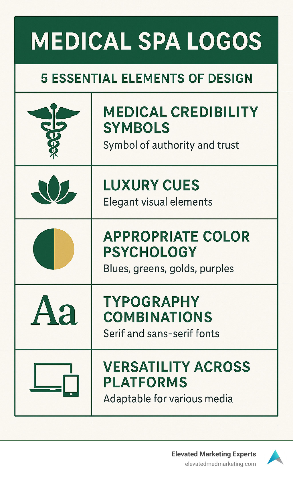
What makes an effective medical spa logo:
| Element | Purpose | Best Practice |
|---|---|---|
| Color palette | Evokes emotion and brand personality | Use blues/greens for trust, gold/purple for luxury |
| Typography | Conveys professionalism and tone | Balance serif fonts (elegance) with sans-serif (modern) |
| Symbols | Represents services and philosophy | Integrate medical symbols with wellness/beauty elements |
| Simplicity | Ensures versatility across platforms | Create a design that works at all sizes |
| Uniqueness | Differentiates from competitors | Avoid generic lotus flowers and spa clichés |
Here’s something worth noting: a professionally crafted medical spa logo can boost brand recognition by up to 80%. That’s not just a nice-to-have—it’s a critical investment when you’re competing in the crowded aesthetics marketplace.
Unlike traditional day spas, your branding needs to walk a delicate line. Too clinical, and you might seem cold or intimidating. Too spa-like, and potential clients might question your medical credentials. The sweet spot? A design that balances clinical authority with luxurious wellness cues.
For a deeper dive into how color influences perception, check out this overview of color psychology.
I’m Joe Amaral, and throughout my years in digital marketing, I’ve helped create dozens of medical spa logos that strike this perfect balance. The most successful ones bridge healthcare credibility with aesthetic appeal, creating memorable identities that resonate with high-value clientele looking for both results and experience.
Want to learn more about building your med spa’s online presence? Check out our resources on content marketing for plastic surgeons, finding the right digital marketing agency for med spas, or implementing local SEO for medical spas.
The Essentials of Medical Spa Logo Design
When potential clients are searching for aesthetic treatments, your medical spa logo is often their first interaction with your brand. It’s not just a decorative element—it’s the visual foundation that communicates who you are before a single word is read.
At Liftd Marketing Experts, we’ve seen how the right logo design can transform a medical spa’s market presence. The most successful practices understand that their logo is a powerful business tool that builds trust—something absolutely essential when clients are considering treatments that affect their appearance and wellbeing.
Your medical spa logo needs to strike a delicate balance that day spas and traditional medical practices don’t face. You’re offering clinical-grade treatments in a luxury environment, and your visual identity should reflect both aspects of your business.
| Feature | Traditional Spa Logos | Medical Spa Logos |
|---|---|---|
| Color Palette | Soft pastels, earth tones | Clinical blues/greens with luxury accents |
| Symbolism | Lotus flowers, water, stones | Medical crosses, anatomical elements, precision lines |
| Typography | Flowing scripts, decorative fonts | Balance of modern sans-serif with neat serifs |
| Overall Feel | Relaxation, indulgence | Professional care with luxury experience |
| Regulatory Tone | Minimal compliance concerns | Must convey medical oversight and credentials |
This distinction matters because your logo needs to instantly position you in the sweet spot between healthcare and wellness—communicating both expertise and indulgence at a glance.
What Are Medical Spa Logos and Why They Matter
A medical spa logo does much more than just look pretty on your website. It’s the visual shorthand that tells potential clients what kind of experience they can expect from your practice. The most effective designs create an immediate sense of both medical professionalism and relaxing comfort.
Research shows that a thoughtfully designed logo can boost brand recognition by up to 80%, directly impacting how many website visitors become actual clients. This is particularly important in the aesthetic medicine field, where treatments are often high-investment decisions that require significant trust.
Color psychology plays a fascinating role in how people perceive your brand. Industry studies reveal that about 85% of consumers cite color as their primary reason for choosing particular services. That’s why the blues and greens that signal medical expertise are often softened or paired with luxurious gold or purple accents in successful medical spa logos.
We’ve watched clients transform their business trajectory after refining their visual identity. One medical spa we worked with saw their email engagement jump by 60% after implementing their new logo across all touchpoints—showing the real-world impact a cohesive brand identity can have on client connection.
Medical Spa Logos vs Traditional Spa Logos
The difference between medical spa logos and day spa logos might seem subtle at first glance, but these nuances communicate crucial information to potential clients. While both businesses offer self-care services, your medical spa provides treatments that require specialized training and medical oversight.
Traditional spas typically accept imagery that evokes pure relaxation—flowing water elements, lotus flowers, and soft, organic shapes. Their logos often use script fonts and earth tones that feel nurturing but not necessarily clinical.
By contrast, effective medical spa logos incorporate elements that subtly signal medical expertise without feeling cold or intimidating. You might see modified medical symbols, precise geometric patterns, or stylized anatomical elements integrated with luxury design touches. The typography choices typically lean toward clean, contemporary fonts that convey both precision and sophistication.
“Your logo needs to reassure clients they’re in medically sound hands while still promising a premium, spa-like experience,” as our creative director often reminds clients. This visual balancing act is particularly important today, when most clients thoroughly research providers online before booking their first appointment.
Your logo serves as an instant visual cue about your practice’s positioning—whether you lean more toward the medical side or the spa experience. Getting this balance right helps potential clients quickly determine if your approach aligns with what they’re looking for, saving both of you time and setting the foundation for a successful relationship.
1. Serene Leaf + Cross Symbol
There’s something almost magical about combining natural elements with medical symbols in a medical spa logo. When a delicate leaf merges with a subtle medical cross, you create an instant visual story that speaks to both sides of what makes medical spas special – clinical expertise wrapped in natural wellness.
This leaf-cross combination has become one of our clients’ favorite design approaches, and for good reason. It perfectly captures that sweet spot between “we know what we’re doing medically” and “we care about natural beauty and wellness.”

I love how versatile this design concept is. Whether it’s displayed on your building signage or shrunk down to a tiny social media icon, the leaf+cross motif remains clear and recognizable. The symbol immediately tells potential clients that you’re offering beauty improvement through medically-sound procedures – no lengthy explanation needed.
One of our favorite success stories involved a medical spa that specialized in natural-looking treatments. After we created a minimalist leaf+cross logo for them, they saw new client inquiries jump by 45%. Their clean, thoughtful design communicated their “natural results through medical expertise” promise at first glance, connecting with exactly the right audience.
Color Insight: Healing Greens
The colors you choose for your medical spa logo speak volumes before a single word is read. Green tones, in particular, work wonders for medical spas looking to strike that perfect balance.
When we talk with clients about using green in their branding, we often explain the fascinating psychology behind it. Green naturally evokes feelings of growth, renewal, and harmony – exactly what someone hopes for when considering aesthetic treatments. It’s also deeply associated with health and healing across many cultures, subtly reinforcing your medical credentials.
What’s particularly interesting is that green is one of the most restful colors for human eyes. It creates an immediate sense of calm and safety – precisely what potential clients need to feel when they’re considering treatments that might otherwise make them nervous.
When we incorporate green into medical spa logos, we might suggest:
- Using a sophisticated gradient from deep forest green to lighter sage, creating depth and professionalism
- Pairing green with subtle neutrals like warm gray or taupe for that perfect clinical-yet-natural feel
- Adding touches of metallic gold or copper with the green for clients positioning themselves in the luxury wellness space
As a Forbes Health article points out, “The healthcare consumer of the future expects visual cues that align with their values.” For many aesthetic patients, those values center around enhancing their natural beauty through safe, medically-sound treatments – a message that healing green tones communicate beautifully and effortlessly.
2. Luxe Monogram Emblem
For medical spas targeting the luxury market, a sophisticated monogram emblem offers an immediate signal of exclusivity and premium service. This style of medical spa logo draws inspiration from high-end fashion houses and luxury brands, creating an association with quality and prestige.
A luxe monogram typically features the initials of your medical spa rendered in an neat, custom-designed typeface, often encircled by a refined emblem or geometric frame. This approach works particularly well for practices named after their founding physician or using a distinctive name that lends itself to abbreviation.
The key to an effective luxury monogram for a medical spa is balancing ornate elements with clinical precision. Unlike fashion monograms that might lean heavily into decorative flourishes, a medical spa logo in this style should maintain clean lines and thoughtful spacing that conveys the precision associated with medical procedures.
Gold, silver, and copper metallics are especially effective for luxury medical spa monograms, as they create an immediate association with premium quality. When paired with deep, rich background colors like navy, emerald, or burgundy, these metallic elements create a sense of depth and sophistication that appeals to high-end clientele.
At Liftd Marketing Experts, we’ve found that luxury monogram logos perform exceptionally well for medical spas offering premium injectables, high-end skincare lines, or exclusive membership programs—all services where the perceived value needs to match premium pricing.
Font Tip: High-Contrast Serifs
The typography you choose for your medical spa logo plays a crucial role in communicating your brand’s personality and positioning. For luxury-oriented medical spas, high-contrast serif fonts offer a perfect balance of elegance and authority.
High-contrast serifs are characterized by the dramatic difference between thick and thin strokes within each letter. This style of typography has historical associations with luxury publications, high-end fashion, and premium brands—making it an excellent choice for medical spas targeting affluent clientele.
The key advantages of high-contrast serifs for medical spa logos include:
- Immediate luxury signaling: These fonts create instant associations with premium brands
- Timeless elegance: Unlike trendy fonts that quickly date, well-chosen serifs have longevity
- Authority and credibility: Serif fonts are still associated with established institutions and expertise
- Distinctiveness: In a field where many competitors use modern sans-serifs, a well-executed serif can help you stand out
When implementing high-contrast serifs in your medical spa branding, consider pairing them with a clean, modern sans-serif for secondary information. This combination creates a sophisticated typographic hierarchy that feels both premium and contemporary.
3. Minimalist Line Art Profile
In recent years, continuous line art has emerged as a powerful trend in medical spa logo design. This approach uses a single, unbroken line to create a simplified facial profile or body contour, neatly representing the improvement of natural beauty that medical spas provide.
What makes this style particularly effective for medical aesthetics is its ability to communicate change and improvement without being overly clinical or medical. The flowing, continuous line symbolizes the seamless journey to improved appearance while the minimalist approach signals sophistication and modern aesthetic sensibilities.
The simplicity of line art logos makes them exceptionally versatile across applications. They reproduce beautifully at small sizes (crucial for social media profiles and mobile viewing), work well in single-color applications like embossing or watermarks, and create a distinctive, memorable visual that clients can easily recognize.
For medical spas focusing on facial treatments, a continuous line facial profile can subtly highlight areas of treatment focus—whether it’s jawline definition, facial contours, or overall facial harmony. Similarly, for body-focused practices, a minimalist silhouette can neatly suggest body contouring services without being explicit or clinical.
At Liftd Marketing Experts, we’ve implemented this approach for several clients with remarkable results. One medical spa specializing in non-surgical facial rejuvenation saw a 35% increase in Instagram engagement after adopting a minimalist line art logo that their audience found both neat and highly shareable.
Why Minimalism Works for Medical Spa Logos
Minimalism in medical spa logo design isn’t just an aesthetic choice—it’s a strategic approach that offers several significant advantages for aesthetic medicine practices.
First, minimalist logos align perfectly with the “less is more” philosophy that underlies many modern aesthetic treatments. Just as the best cosmetic procedures improve natural beauty without appearing overdone, a minimalist logo communicates refinement and subtlety—qualities that sophisticated aesthetic clients value.
Second, minimalist designs have superior technical versatility. They scale effectively from large signage to tiny favicon icons without losing clarity or impact. This is increasingly important in today’s multi-platform marketing environment, where your logo needs to perform across digital and physical touchpoints.
“Minimalist and nature-inspired logos are among the most popular styles for medical spas,” according to industry research, “as seen in the prevalence of lotus, leaf, and floral motifs across leading stock image platforms.” However, the most successful medical spas take these common elements and distill them to their essential forms, creating something distinctive rather than generic.
Third, minimalism aligns with luxury positioning. The most premium brands across industries often employ restrained, minimal aesthetics—think Apple, Chanel, or Céline. This association helps position your medical spa in the premium category, supporting higher price points and attracting quality-focused clients.
Finally, minimal logos tend to have greater longevity than heavily stylized or trend-dependent designs. When investing in your medical spa logo, considering its long-term viability is crucial for building consistent brand recognition over time.
4. Techno-Wave Gradient
For medical spas showcasing their cutting-edge technology and advanced procedures, a dynamic techno-wave gradient logo creates an instant impression of innovation and scientific expertise. This modern approach to medical spa logos uses flowing wave forms and contemporary gradient techniques that speak directly to clients seeking the latest in aesthetic treatments.
The wave element isn’t just pretty – it symbolizes change, energy, and the dynamic nature of modern aesthetic medicine. When paired with gradient coloration (typically flowing through cool blues, teals, and purples), it creates a sense of depth while reinforcing connections to medical technology and digital innovation.
I’ve noticed this style works particularly well for med spas offering high-tech treatments like advanced laser therapies, RF microneedling, ultrasound skin tightening, AI-powered skin analysis, or those embracing virtual consultations. The visual language immediately signals to potential clients that your practice isn’t stuck in the past – you’re leveraging cutting-edge technology for superior results.
This positioning matters more than ever as the medical spa market becomes increasingly competitive. As one of our clients recently told me, “Our tech-forward logo helped us stand out in a sea of lotus flowers and spa clichés.”
“The telehealth market has seen a 63× increase since 2020,” according to industry data, “with 71% of in-person visits now possible through remote technologies.” A tech-forward medical spa logo can position your practice perfectly to capitalize on this digital evolution in aesthetic medicine.
Conveying Innovation & Safety
The real challenge for technology-focused medical spa logos is finding that sweet spot between exciting innovation and reassuring safety. After all, clients want cutting-edge results but not experimental risks!
The most successful techno-wave designs accomplish this balance through thoughtful color selection and controlled dynamism. Cool blue tones remain the dominant choice because they simultaneously convey technological sophistication and medical trustworthiness. Blue naturally evokes feelings of reliability, cleanliness, and professionalism – all qualities critical for medical aesthetic practices. When used in gradient form with subtle shifts to teal or violet, blue creates a contemporary feel without sacrificing its trustworthy associations.
One of our clients who adopted this approach saw a 40% increase in bookings for their advanced treatment options after the rebrand, with exit surveys showing clients perceived the practice as “more innovative” and “medically advanced” based partly on their new visual identity.
According to research on telehealth growth, “Consumer perception of telehealth has improved substantially since the start of the pandemic,” showing growing comfort with technology-mediated healthcare experiences. Your medical spa logo can reinforce this comfort by balancing tech-forward elements with familiar medical visual cues.
For practices heavily invested in technological differentiation, you might consider incorporating subtle digital elements – perhaps pixelation effects, circuit-inspired patterns, or data visualization aesthetics. Just remember to maintain a clean, precise execution that suggests the same attention to detail clients can expect from your treatments. The goal isn’t to look like a tech startup, but rather a medical practice at the forefront of innovation.
At Liftd Marketing Experts, we’ve helped several technology-focused medical spas develop logos that effectively communicate their innovative approach while maintaining the clinical credibility essential for building lasting patient trust. The right balance creates a powerful first impression that sets the stage for everything else your practice offers.
5. Botanical Mandala Seal
There’s something truly special about botanical mandala designs for medical spa logos – they manage to weave together ancient wellness wisdom with modern medical precision in one beautiful, balanced symbol.

Think of these designs as nature’s geometry – symmetrical arrangements of lotus petals, leaves, or floral elements organized in circular patterns that instantly create a sense of harmony and balance. While the botanical elements speak to natural beauty and wellness traditions, the precise geometric arrangement signals scientific expertise and attention to detail.
What I love about this approach for medical spas is how it lifts potentially common spa imagery into something distinctive and memorable. Yes, industry research confirms lotus flowers appear frequently in spa branding, but when transformed into a mandala-like medallion, that same lotus becomes something special – a symbol that feels both grounding and uplifting.
The medallion quality of these designs carries another subtle benefit – it creates associations with certification, achievement, and authority. This visual cue subtly reinforces your medical credentials without being overtly clinical, perfect for practices that want to highlight their professional standards while maintaining a welcoming aesthetic.
I’ve seen botanical mandala medical spa logos work wonderfully for practices offering:
Medical-grade facials with natural ingredients – where the botanical elements reflect your ingredient philosophy while the precision reflects your medical oversight
Eastern-influenced wellness treatments – where the mandala structure honors traditional practices while presenting them in a contemporary context
Holistic skin health approaches – where the circular, interconnected design mirrors your comprehensive treatment philosophy
Integrative pre/post-treatment protocols – where the balance of natural and geometric elements reflects your balanced approach
Combining Tradition with Clinical Authority
Today’s aesthetic patients are increasingly savvy – they want results, of course, but many are equally interested in how those results are achieved. The botanical mandala approach to medical spa logos speaks directly to this modern mindset by honoring wellness traditions while establishing clear clinical credibility.
The secret to making this style work isn’t just in choosing the right botanical elements – it’s in the execution. Rather than loose, free-flowing arrangements, the most effective designs employ precise geometry, clean lines, and perfect symmetry. This precision sends a clear message: while your practice respects traditional wellness wisdom, you apply it with scientific rigor and medical expertise.
Color choices play a huge role in striking this balance too. Instead of the earthy browns and soft pastels common in traditional day spas, consider more sophisticated palettes that lift the design. Deep emerald green paired with gold accents creates a sense of luxury and renewal. Rich teal with silver highlights feels both medical and mystical. Even traditional colors can be modernized through subtle gradients or ombre effects that add depth and visual interest.
At Liftd Marketing Experts, we’ve noticed that botanical mandala logos perform exceptionally well for medical spas looking to attract clients who might be hesitant about overtly clinical aesthetics. The familiar natural elements create comfort and accessibility, while the precise execution reassures clients of your professional standards – the perfect visual bridge between wellness and medicine.
6. Clean Wordmark with Pop of Color
Sometimes the most effective medical spa logo is one that lets your name do the talking. A clean wordmark with a thoughtful pop of color offers neat simplicity while creating something distinctive that clients will remember.
This approach is all about custom typography—either modifying an existing typeface or creating completely custom lettering—to make your medical spa’s name visually special. The magic happens when you add that strategic “pop” of color to a specific letter, symbol, or element within your name.
I’ve seen this approach work wonders for many of our clients at Liftd Marketing Experts. There’s something timeless about a beautifully crafted wordmark that simply can’t be achieved with more complicated designs.
What makes wordmarks particularly effective for medical spas? For starters, they put your name front and center, helping with immediate recognition. The clean, sophisticated simplicity signals attention to detail—exactly what clients want in someone performing aesthetic treatments! Plus, wordmarks are incredibly versatile, working beautifully everywhere from your building signage to tiny social media icons.
When it comes to that pop of color, choose wisely as it speaks volumes about your brand. A touch of coral or warm pink suggests vitality and rejuvenation (perfect for anti-aging services), while teal communicates tranquility with medical precision. For luxury positioning, nothing beats a metallic gold accent to signal premium services.
“Custom typography can embed subtle meanings—like a spine curve in a massage logo—reinforcing service attributes,” notes design research. I love how this principle applies to medical spa wordmarks, where gentle modifications to certain letters can subtly reference facial contours or the smooth results of successful treatments.
Accessibility Check for Medical Spa Logos
When developing your medical spa logo, particularly wordmarks that rely heavily on typography, accessibility shouldn’t be an afterthought—it should be a priority. An accessible logo is one that all potential clients can easily perceive and understand, including those with visual impairments or color vision differences.
Contrast is your friend here. The Web Content Accessibility Guidelines recommend a minimum contrast ratio of 4.5:1 between text and background for standard text. For your logo elements, strong contrast ensures visibility across all applications—whether it’s on your website, printed brochures, or outdoor signage.
Approximately 8% of men and 0.5% of women experience some form of color vision deficiency. This doesn’t mean you can’t use color creatively, but it does suggest avoiding problematic combinations (like red/green) or ensuring that color isn’t the only way information is conveyed.
Another practical consideration is how your medical spa logo performs at different sizes. That gorgeous wordmark might look perfect on your building, but can people recognize it as a tiny favicon or mobile app icon? Testing at various sizes ensures your brand remains identifiable everywhere.
At Liftd Marketing Experts, we believe accessible design isn’t just about checking boxes—it’s about connecting with the widest possible audience. A thoughtfully designed, accessible medical spa logo demonstrates your practice’s attention to detail and commitment to inclusivity—values that patients notice and appreciate in their care experience too.
Best Practices: Colors, Fonts & Versatility
When it comes to creating a medical spa logo that truly represents your brand, the details matter. I’ve seen how the right combination of colors, fonts, and versatile design elements can transform a good logo into a great one that resonates with clients and stands the test of time.
Color isn’t just about aesthetics—it’s about psychology. Research shows that 85% of consumers cite color as the primary reason they choose certain products or services. That’s powerful! For medical spas specifically, your color palette communicates volumes about your approach to care and your overall brand personality.
Blues and teals remain the gold standard for conveying cleanliness and medical authority, while greens speak to natural healing and wellness approaches. I’ve found that purples work beautifully for practices focusing on anti-aging and change, while metallics like gold and copper instantly lift your brand to premium status. Most successful medical spa logos use a primary color to establish their core identity, with a secondary accent color and a couple of neutral tones for balance and versatility.
Typography choices are equally important in striking that perfect balance between clinical expertise and spa comfort. Think of your font selection as your brand’s voice—is it authoritative but warm? Modern yet timeless? The most effective approach typically includes a distinctive primary font that becomes synonymous with your brand, complemented by a secondary font that creates visual contrast. Many of my clients find that pairing a clean sans-serif with a neat serif creates that perfect medical-meets-luxury feeling that aesthetic clients respond to.
When exploring fonts for your brand, your selection should reflect your unique positioning. More clinical practices often lean toward clean, modern sans-serifs that convey precision, while those emphasizing luxury experiences might choose neat serifs with distinctive characteristics that feel special and liftd.
Making Medical Spa Logos Work Everywhere
Your medical spa logo needs to look fantastic everywhere—from your building signage to a tiny favicon on a mobile browser. This versatility doesn’t happen by accident; it requires thoughtful planning and developing what I like to call a “logo system” rather than just a single design.
At minimum, your medical spa should have a primary logo (the full, preferred version), a secondary or horizontal arrangement for different space requirements, a simplified icon for very small applications, a text-only wordmark, and monochrome versions for special applications like embossing or black-and-white printing.
I often remind my clients to consider both physical and digital applications of their logo. On the physical side, think about how your logo will appear on exterior signage (both illuminated and non-illuminated), interior walls, staff uniforms, treatment room elements, product packaging, and gift certificates. For digital applications, consider your website header and favicon, social media profiles, email signatures, digital ads, and even mobile app icons if applicable.
The goal is seamless brand recognition regardless of where potential clients encounter your practice. When a client sees your logo on Instagram and then drives past your location, that moment of recognition creates a powerful connection—but only if your logo maintains its integrity across both contexts.
At Liftd Marketing Experts, we develop comprehensive medical spa logo systems that maintain brand integrity across all these touchpoints. We understand that your logo is more than just a pretty design—it’s a critical business asset that works around the clock to build recognition and trust with potential clients.
For practices looking to extend their branding beyond just logo design, I encourage you to explore our Medical Spa Web Design services, where we ensure your visual identity carries through to your entire online presence.
Common Mistakes and When to Rebrand
Let’s face it – even the most beautiful medical spa logo can start to feel outdated over time. It happens to the best of us! I’ve seen countless practices struggle with logos that worked perfectly when they launched but no longer reflect who they are today.
Think of your logo like a hairstyle – what looked amazing in 2010 might make you cringe a little today. The same principle applies to your visual branding.
Common Logo Design Mistakes
The path to an effective medical spa logo is filled with potential pitfalls. I’ve helped many practices recover from these common mistakes:
Over-complexity is perhaps the biggest culprit I see. When a practice tries to include too many elements, colors, or details, the logo becomes cluttered and difficult to reproduce consistently. The most powerful logos accept strategic simplicity – think Apple or Nike.
Generic symbolism is another trap that’s surprisingly easy to fall into. Industry research confirms what we’ve all noticed – lotus flowers are everywhere in spa branding! While these symbols have beautiful meanings, they make it incredibly difficult for your practice to stand apart in a crowded marketplace.
I once worked with a medical spa that had a lotus flower logo nearly identical to three competitors within a 10-mile radius. Potential clients were actually confusing them with other practices!
A disconnect from positioning creates confusion for potential clients. Your logo should visually reflect your actual services and market position. If you’re a clinically-focused medspa with advanced treatments but your logo screams “day spa,” you’re sending mixed signals about your expertise.
Poor scalability becomes painfully apparent in today’s mobile-first world. A logo that looks gorgeous on your building signage but becomes an unrecognizable blur as a social media profile picture isn’t doing its job effectively.
Finally, chasing trends without considering longevity can lead to frequent and costly updates. While your medical spa logo should feel contemporary, building it around fleeting design trends means it will quickly look dated.
Red Flags That Signal a Logo Update
How do you know when it’s time for a refresh? I encourage the medical spas I work with to watch for these telltale signs:
Declining engagement metrics often serve as an early warning system. If your website traffic, email open rates, or social media engagement are dropping despite consistent marketing efforts, your visual branding may no longer connect with your target audience.
Service evolution naturally happens as practices grow. A logo designed when you primarily offered Botox might not effectively represent your practice after you’ve expanded into body contouring, laser treatments, and medical-grade skincare. Your visual identity should grow with you.
Marketplace positioning shifts are inevitable in the rapidly evolving medical aesthetics industry. Perhaps you launched as a budget-friendly option but have since liftd your offerings to the luxury market. Your logo should reflect your current position, not where you started.
Ownership changes or mergers often necessitate rebranding to reflect the unified entity and signal a fresh start to clients. This is especially true if the practice name changes or if you’re combining two established brands.
Visual dating happens naturally over time. If your logo was designed more than 7-10 years ago, it likely appears outdated compared to competitors, regardless of its original quality. Design trends evolve, and staying current signals that your treatments and technology are current too.
The impact of updating your visual identity can be substantial. Our clients who implement professional rebranding, including logo redesign, typically see email open rates increase by up to 60% and conversion rates double. These performance improvements often justify the investment in refreshing your brand.
At Liftd Marketing Experts, we recommend medical spas conduct a friendly brand audit every 3-5 years. This helps you assess whether your visual identity still effectively communicates your current positioning and appeals to your target clients. Sometimes, subtle refinements to an existing medical spa logo can breathe new life into your brand without sacrificing the recognition you’ve worked hard to build.
Your logo is often the first impression potential clients have of your practice. Making sure it accurately reflects who you are today – not who you were when you opened – is one of the smartest investments you can make in your practice’s future growth.
Frequently Asked Questions about Medical Spa Logos
How can a logo communicate medical credibility and spa serenity?
Creating a medical spa logo that balances clinical expertise with relaxing spa vibes is a bit like making the perfect cocktail—it’s all about the right mix of ingredients.
When we work with clients at Liftd Marketing Experts, we find that medical credibility comes through in the precision of the design itself. Clean lines, carefully structured layouts, and thoughtfully spaced typography all signal the attention to detail that clients expect from medical professionals. Sometimes we’ll incorporate subtle medical symbols—perhaps a modified cross or caduceus element—that hint at clinical expertise without screaming “hospital.”
The serenity aspect is where the magic happens. We soften those clinical elements with flowing lines, organic shapes, and natural motifs like gentle leaf forms or water-inspired curves. The color palette plays a huge role too—adding a soft teal or calming blue can maintain that medical feel while still evoking tranquility.
What really makes these logos work isn’t just throwing medical and spa elements together—it’s thoughtfully integrating them. Imagine a precise geometric framework that contains a flowing botanical element, or a structured wordmark with a single organic flourish. These combinations reflect what your clients actually experience: clinical expertise delivered in a soothing environment.
Should I prioritize medical or beauty elements in my design?
This is one of the most common questions we hear, and honestly, the answer depends entirely on your practice’s unique positioning. Think of it as a spectrum—where does your medical spa sit between “clinical medical provider” and “luxury spa experience”?
If your practice is led by physicians and primarily offers medical treatments like injectables, laser therapies, and medical-grade peels, your medical spa logo should lean more heavily toward medical elements with just subtle beauty touches. The visual message should emphasize results and expertise.
On the flip side, if you offer numerous traditional spa services alongside your medical treatments, a more balanced approach makes sense. Your logo might incorporate more wellness and luxury cues while still maintaining clinical credibility.
Your target demographic plays a huge role in this decision too. Some clients are specifically seeking out medical credentials and expertise—they want results above all else. Others might feel intimidated by overly clinical branding and respond better to imagery that emphasizes the experience and wellness aspects.
We also recommend considering your local competition. In markets flooded with traditional day spas, emphasizing your medical credentials creates clear differentiation. If you’re in an area with many medical aesthetic providers, highlighting your spa-like experience might help you stand out.
As our design team often tells clients: “The typography in your logo speaks volumes about your positioning. High-contrast serifs paired with clean sans-serifs create a sophisticated hierarchy that feels both premium and contemporary.”
How often should a medical spa refresh its logo?
Logo refreshes are a bit like skincare treatments—the timing depends on your specific situation, but regular maintenance keeps everything looking fresh!
At Liftd Marketing Experts, we typically recommend evaluating your medical spa logo every 3-5 years. This doesn’t mean starting from scratch each time—sometimes subtle refinements are all you need to keep your logo current while maintaining the brand recognition you’ve built.
Major business changes should trigger a logo evaluation regardless of timeline. If you’ve added significant new services, changed ownership, or shifted your market positioning, your visual branding should evolve to reflect these changes.
Some design elements simply date more quickly than others. Those trendy effects and of-the-moment typography choices that seemed so fresh a few years ago might now be making your brand look behind the times. Classic, timeless designs generally need less frequent updates.
We also pay attention to competitive positioning. If all your competitors have refreshed their branding and your logo now looks dated by comparison, it might be time for an update to maintain your market position.
Declining engagement with your marketing materials often signals that your visual branding no longer resonates with your target audience. When we see metrics dropping despite consistent marketing efforts, we often recommend a brand refresh.
The data backs up the importance of keeping your logo current—research shows a well-designed logo can increase brand recognition by up to 80%. That’s why we consider logo maintenance a strategic business investment rather than simply a design expense.
At Liftd Marketing Experts, we help medical spas evaluate their existing branding through both aesthetic assessment and performance analytics to determine the perfect timing for refreshes or redesigns. After all, in the competitive medical aesthetics field, looking your best is just good business!
Conclusion
Your medical spa logo isn’t just a pretty design—it’s a powerful business asset that speaks volumes about who you are before clients ever walk through your door. The best logos find that sweet spot between medical credibility and spa-like appeal, positioning your practice exactly where your ideal clients are looking.
Whether you’ve fallen in love with a serene leaf+cross symbol that beautifully bridges nature and medicine, a luxurious monogram that whispers “premium experience,” or a clean wordmark with just the right pop of color, your logo should feel authentically you. It should capture the essence of what makes your medical spa special in a market where standing out matters.
At Liftd Marketing Experts, we’ve seen how the right medical spa logo can transform a practice’s market presence. We understand the unique challenges of aesthetic medicine branding—how your logo needs to work everywhere from building signage to tiny social media avatars while maintaining its impact and meaning.
Your logo is just one piece of your brand puzzle. For truly effective marketing, it needs to be supported by consistent application across all touchpoints, complementary design elements, and messaging that reinforces what makes your practice exceptional. When all these elements work in harmony, potential clients experience your brand as trustworthy, professional, and worthy of their investment.
Ready to lift your medical spa’s visual identity with a logo that truly captures your practice’s excellence? Our team specializes in creating distinctive visual identities for aesthetic practices just like yours. Explore our comprehensive Medical Spa Branding services to find how we can help transform your practice’s market presence through thoughtful, strategic design.
The right medical spa logo doesn’t just look good—it works hard for your business every single day, building recognition, trust, and connection with the clients you most want to serve. It’s an investment in your practice’s future that pays dividends with every impression.


