

Effective call-to-action examples: 10 Proven Ways to Skyrocket Conversions 2025
Why CTAs Are Critical for Converting Website Visitors into Patients
Effective call-to-action examples can turn your practice’s website from an online brochure into a patient-generating machine. Below are the CTA types that reliably move the needle for medical practices:
High-Converting CTA Categories:
– Lead Generation: “Get Free Consultation”, “Schedule Your Assessment”
– Risk-Free Offers: “Try Risk-Free for 30 Days”, “No-Obligation Consultation”
– Benefit-Focused Actions: “Transform Your Smile”, “Find Your Results”
– Urgency-Driven: “Limited Spots Available”, “Book This Month”
– Social Proof Improved: “Join 1,000+ Happy Patients”, “See Why Patients Choose Us”
The reality is stark: 90 % of visitors scan only the headline and CTA, making those buttons your digital front desk.
Clear, specific CTAs can lift conversions by 161%, and personalized versions perform 202% better than generic ones. For aesthetic practices, that difference often decides whether your calendar is full or half-empty.
The psychology behind great CTAs blends urgency, clarity, and trust. Prospective patients are vulnerable—researching procedures and comparing providers. Your button must acknowledge their mindset and guide them to a safe next step.
I’m Joe Amaral. After founding multiple digital marketing companies, I’ve watched effective call-to-action examples double consultation requests for practices like yours. In this guide, I’ll share the tactics that consistently increase bookings.
Easy Effective call-to-action examples glossary:
– Conversion rate optimization tips
– Cross-promotion opportunities
– Data-driven marketing strategies
What You’ll Learn
You’ll find:
– The psychological triggers that compel visitors to act
– Real-world examples from high-converting practices
– Channel-specific tactics for web, email, social, and ads
– Testing methods to keep improving results
– Mistakes that kill conversions—and how to avoid them
By the end, you’ll have a practical CTA toolkit ready to boost consultation requests and revenue.
Why Calls-to-Action Matter in Modern Marketing
Your website’s call-to-action buttons are like the front desk of your practice – they’re where interested visitors decide whether to take the next step or walk away. Without effective CTAs, even your most engaged prospects will browse your beautiful content and then… disappear into the digital void.
90% of website visitors only read headlines and CTA copy. They’re not diving deep into your service descriptions or reading every testimonial. This scanning behavior means your CTAs carry enormous weight in guiding potential patients through their decision-making journey.
Think of each CTA as creating a “micro-yes” moment in your conversion funnel. When someone clicks “Learn More About CoolSculpting,” they’re not just gathering information – they’re making a small psychological commitment to your practice. Each micro-yes builds momentum toward that bigger decision: booking a consultation.
The buyer’s journey in aesthetic medicine is particularly complex. Patients often research procedures for months, compare multiple providers, and wrestle with both financial and emotional considerations. Your CTAs need to meet them wherever they are in this process.
Trust signals become absolutely critical in medical CTAs. Unlike e-commerce buttons that might say “Add to Cart,” your CTAs need to address the inherent vulnerability patients feel when choosing a medical provider. Phrases like “Consult with Board-Certified Surgeon” or “Schedule with 20+ Years Experience” can dramatically improve conversion rates by building confidence right in the button copy.
The psychology of urgency also plays a fascinating role here. Scientific research on urgency psychology reveals that time-sensitive language activates our loss aversion instincts – we’re naturally more motivated to avoid missing out than to gain something. This is why “Limited Consultation Spots This Month” often outperforms “Schedule Your Consultation.”
The beauty of effective call-to-action examples is that they work at every stage of the patient journey. Whether someone is just starting to research procedures or ready to book, the right CTA can guide them forward without feeling pushy or overwhelming.
Traits of a High-Converting CTA
What separates a button that gets clicked from one that gets ignored? After analyzing thousands of effective call-to-action examples across medical practices, certain patterns emerge that consistently drive higher conversion rates.
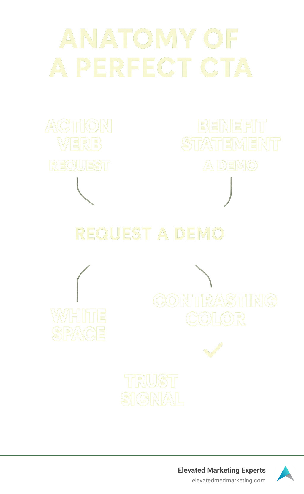
The magic starts with your verb choice. Weak CTAs use passive language like “Information” or “Learn More” – words that create zero excitement or urgency. High-converting buttons lead with action verbs that create momentum: “Transform,” “Schedule,” “Find,” or “Get.” These verbs tell visitors exactly what will happen when they click.
“Schedule Consultation” becomes powerful when it transforms into “Get Your Custom Treatment Plan” or “Find Your Best Look.” This shift helps potential patients visualize the value they’ll receive, not just the step they’re taking.
Color psychology plays a fascinating role in CTA performance. While there’s no universally “perfect” button color, contrast is everything. An orange button on a blue background will dramatically outperform a blue button on that same blue background.
Research shows some interesting patterns in button color performance. Red buttons often lift conversions by 21%, particularly for urgent offers. Orange tends to perform even better, with average lifts of 32.5% for general consultation CTAs. Green works well for “safe” actions like downloading guides, while blue serves as a reliable baseline for professional services.
Placement strategy can make or break your conversion rates. Your primary CTA needs to be visible immediately when someone lands on your page – what we call “above the fold.” This is especially critical since most visitors won’t scroll down to hunt for your call-to-action button.
White space around your CTA button isn’t just aesthetic – it’s conversion gold. Studies show that surrounding your button with adequate white space can improve click-through rates by up to 232%. This breathing room draws the eye naturally to your CTA and reduces visual competition from other page elements.
Mobile-first design has become non-negotiable with over 60% of medical searches happening on smartphones. Your CTA buttons need to be thumb-friendly – at least 44 pixels tall with enough spacing to prevent accidental clicks.
Accessibility considerations expand your potential patient base. This means ensuring sufficient color contrast for visually impaired users, using descriptive button text that works with screen readers, and supporting keyboard navigation.
| Button Color | Average Conversion Lift | Best Use Case |
|---|---|---|
| Red | +21% | Urgent actions, limited offers |
| Orange | +32.5% | General CTAs, consultations |
| Green | +13% | “Safe” actions, downloads |
| Blue | Baseline | Professional services |
The most successful practices combine these elements strategically rather than hoping one magic bullet will solve their conversion problems. When your action verb, benefit language, color contrast, and placement all work together, the results can be transformative for your patient acquisition efforts.
Effective Call-to-Action Examples Across Channels

Modern patient journeys are messy and multi-channel. A potential patient might see your Instagram ad during their morning coffee, click through to your website during lunch, and finally book a consultation after receiving your follow-up email. This requires effective call-to-action examples at every touchpoint.
Personalized CTAs are absolute game-changers – they perform 202% better than generic alternatives. But personalization goes beyond just adding someone’s first name. It means understanding where they are in their journey and what they actually want to know next.
When someone’s researching rhinoplasty, “Learn About Nose Surgery” hits differently than “Schedule Your Consultation.” The first acknowledges they’re still learning, while the second assumes they’re ready to commit.
The single versus multiple CTA debate has a clear winner – strategic hierarchy works best. Your primary CTA should dominate the page visually, while secondary options serve different user needs. Think “Schedule Consultation” as your main button, with a smaller “Download Treatment Guide” for those who aren’t ready to book yet.
Social proof integration transforms ordinary buttons into trust-building powerhouses. “Join 1,000+ Happy Patients” carries more weight than “Book Now” because it addresses the underlying question every patient has: “Am I making the right choice?”
Website & Landing Page Winners
Slack revolutionized CTA copy with their simple “Get Started” approach. It’s non-threatening, clear, and removes the pressure that often comes with medical decisions. For aesthetic practices, this translates beautifully to CTAs like “Start Your Journey” or “Begin Your Change.”
Square’s “Get Free Card Reader” strategy leads with immediate value rather than asking for commitment first. Medical practices can mirror this approach with offerings like “Get Your Free Skin Analysis” or “Receive Your Custom Treatment Plan.” You’re giving before you’re asking.
Netflix mastered the art of removing friction with their streamlined “Get Started” experience. For medical practices, this means questioning every form field and contact barrier.
These examples demonstrate a great way to increase conversions by focusing on psychology rather than just pretty button design.
Email & Pop-Up Champions
Headspace’s “Snuggle up to Headspace” CTA works because it perfectly matches their cozy, approachable brand personality. The lesson here isn’t to copy their exact words, but to ensure your CTA voice aligns with your practice’s overall tone.
Welcome gates convert at impressive 10-25% rates when done thoughtfully. For medical practices, a welcome gate offering a “Free Treatment Comparison Guide” or “Consultation Preparation Checklist” provides immediate value while capturing contact information.
The key is timing and value. Nobody wants to be interrupted by a pop-up asking for their email address before they’ve even read your content. But after they’ve spent time exploring your before/after gallery? That’s when a well-crafted offer can feel helpful rather than pushy.
These strategies align perfectly with proven conversion rate optimization tips that consistently work for medical practices.
Social Media & Ad Standouts
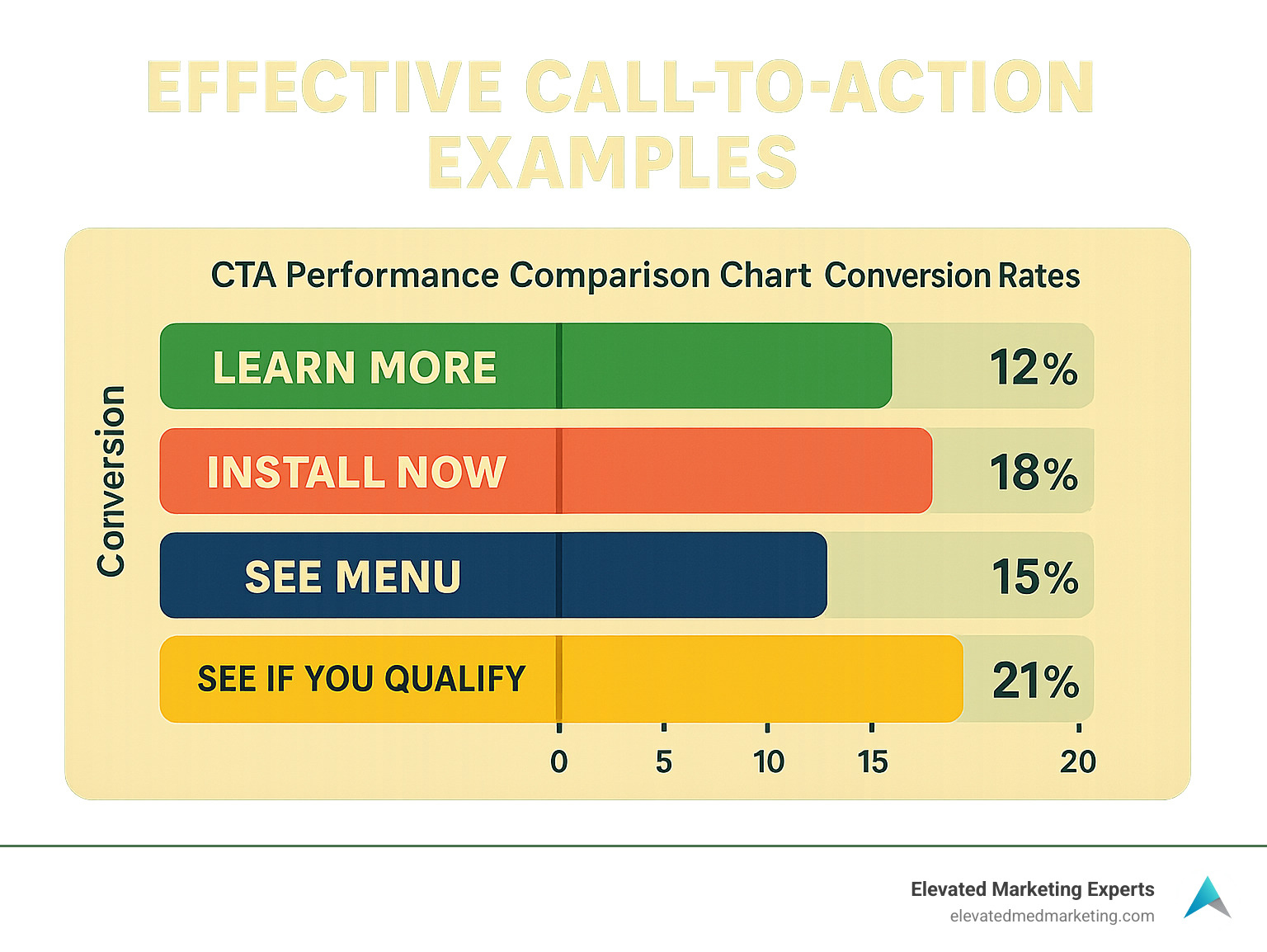
Facebook’s “Shop Now” button succeeds because it sets crystal-clear expectations about what happens next. For medical advertising, buttons like “Book Consultation” or “Learn About Treatment” perform significantly better than vague options like “Learn More” or “Click Here.”
Instagram’s “Install Now” demonstrates the power of specific, action-oriented language. Medical practices should accept similarly direct CTAs: “Schedule Today” creates more urgency than “Contact Us,” and “Book Consultation” is clearer than “Get Information.”
The most effective social media CTAs balance urgency with curiosity. “Limited Consultation Spots – See If You Qualify” combines time pressure with the intrigue of qualification criteria.
Creative & Unconventional CTAs
Manpacks’ “Build a Manpack” CTA transforms users from passive browsers into active participants. Medical practices can harness this same psychology with CTAs like “Design Your Treatment Plan” or “Create Your Change Timeline.” When people feel involved in the process, they’re more invested in the outcome.
Strategic use of negative space around CTAs can improve conversions by an astounding 232%. This technique works by eliminating visual competition and drawing the eye naturally to your call-to-action button.
Crafting CTAs for Different Audiences & Journey Stages
Picture this: A potential patient lands on your website after searching “rhinoplasty before and after” on Google. They’re curious but nervous, probably looking at five other practices too. Now imagine another visitor who’s been following your social media for months, downloaded your treatment guide, and is ready to book. These two people need completely different call-to-action approaches.
Top-of-funnel patients are just starting to explore their options. They’re building trust and gathering information. These visitors respond well to low-commitment CTAs like “Download Free Guide” or “Watch Patient Stories.” The goal here isn’t to get them in the door immediately – it’s to start a relationship.
Middle-of-funnel patients are in comparison mode. They know they want a procedure, but they’re shopping around for the right provider. These folks are ready for slightly more commitment. CTAs like “Schedule Free Consultation” or “Get Custom Treatment Plan” work beautifully here because they offer personalized value while still feeling safe.
Bottom-of-funnel patients are decision-ready. They’ve done their research, they trust your practice, and they’re ready to move forward. This is where direct CTAs like “Book Your Procedure” or “Reserve Your Spot” really shine. Don’t be shy about being direct with these visitors – they want clarity, not more information.
The key is recognizing that different patient personas respond to different messaging approaches. Busy professionals might love a CTA that says “Quick 15-Minute Consultation,” while patients focused on dramatic results might prefer “See Your Potential Change.”
Secondary CTAs are your secret weapon for capturing visitors who aren’t ready for your main ask. If your primary button says “Schedule Consultation,” your secondary might offer “Download Treatment Guide.” This way, you’re not losing people who need more time to decide – you’re nurturing them for future conversion.
This multi-layered approach aligns perfectly with a comprehensive content marketing strategy that guides prospects through their entire decision-making journey.
Personalization & Dynamic Content
Personalized CTAs perform 202% better than generic ones. That’s not a typo – over double the performance just by making your buttons more relevant to each visitor.
This personalization can be surprisingly simple. Instead of a generic “Schedule Consultation,” try “Find Denver’s Top Plastic Surgeon” for local visitors or “Recommended by Dr. Smith” for referral traffic. These small tweaks make visitors feel like you’re speaking directly to them.
First-person copy is another powerful technique that most practices overlook. “Get My Consultation” creates a sense of ownership that “Get Your Consultation” simply doesn’t match.
Behavioral triggers can transform your conversion rates when used thoughtfully. Exit-intent pop-ups with messages like “Wait! Get 20% Off Your First Treatment” can recover visitors who were about to leave.
Copy & Design Checklist
Every high-converting CTA needs to pass the three-second test. When someone looks at your button, they should instantly understand what will happen when they click, what benefit they’ll receive, and how much effort is required from them.
Clarity beats cleverness every single time. Save the poetry for your blog posts – make your CTAs crystal clear.
Relevance is non-negotiable. Your CTA must connect logically to the content that comes before it. A blog post about tummy tucks should lead to a tummy tuck-specific consultation, not a generic contact form.
Specificity wins because it reduces uncertainty. “Schedule Your Botox Consultation” tells visitors exactly what they’re signing up for, while “Learn More” leaves them guessing.
Testing, Optimizing & Measuring CTA Performance

Creating effective call-to-action examples is only half the battle. The real magic happens when you start testing and refining your CTAs based on actual patient behavior. I’ve seen practices double their consultation bookings simply by changing a few words on their buttons.
A/B testing forms the foundation of CTA optimization. Think of it as a scientific experiment where you test one element at a time. You might test button copy and length first, comparing “Schedule Consultation” against “Get Your Free Assessment.” Then move on to color and design variations, followed by placement and size adjustments. The key is changing only one thing at a time so you know exactly what’s driving the improvement.
Statistical significance requires patience and adequate sample sizes. Wait until you reach at least 95% confidence level before making permanent changes. I’ve seen practices hurt their conversions by jumping to conclusions too quickly.
Heat maps and click tracking tools like Hotjar reveal the truth about how patients actually interact with your pages. You might find that your perfectly designed CTA is invisible to most visitors, or that patients are clicking on elements that aren’t even buttons.
The metrics that matter most for medical practices include click-through rate (CTR), which shows what percentage of visitors click your CTA, and conversion rate (CVR), which tracks how many actually complete the desired action. Cost per acquisition (CPA) tells you exactly how much each new patient costs to acquire.
Iterative improvement should become part of your regular routine. Set aside time monthly to review CTA performance and plan new tests. Research from CTA statistics studies shows that practices committed to continuous optimization see 30% higher conversion rates than those who set-and-forget their buttons.
Tools & Methodologies
Unbounce makes testing landing page CTAs surprisingly simple with its drag-and-drop builder. You can create multiple versions of your consultation request page and automatically split traffic between them.
Google Optimize integrates beautifully with Google Analytics, making it perfect for testing CTAs on your existing website. You can see exactly how CTA changes affect your overall patient acquisition goals. The best part? It’s completely free.
HubSpot’s CTA tool offers Smart CTAs that show different buttons to different visitors based on where they are in their patient journey. Someone who’s downloaded your procedure guide might see “Schedule Your Consultation” while first-time visitors see “Learn About Treatment Options.”
Common Pitfalls to Avoid
Too many competing CTAs create what psychologists call decision paralysis. When patients see five different buttons, they often choose none. Stick to one primary CTA per page, with secondary options clearly distinguished through size, color, or placement.
The “Submit” button mistake kills conversions faster than almost anything else. This generic, uninspiring word tells patients nothing about what happens next. Replace “Submit” with specific, benefit-focused language like “Get My Custom Plan” or “Book My Consultation.”
Bait-and-switch offers destroy trust immediately. If your CTA promises a “Free Consultation” but your landing page mentions fees or requirements, you’ve broken the patient’s trust before they even meet you.
Mismatched tone creates confusion about your practice personality. A serious surgical practice shouldn’t use overly casual language like “Let’s Chat!” while a modern aesthetic clinic might find formal language like “Submit Inquiry” off-putting.
CTA optimization is a marathon, not a sprint. Small improvements compound over time, and what works for other practices might not work for yours. The only way to know for sure is to test with your actual patients and let their behavior guide your decisions.
Frequently Asked Questions about Effective Call-to-Action Examples
What’s the ideal length for CTA copy?
When it comes to effective call-to-action examples, shorter is almost always better. The American Press Institute found something fascinating about how we process information: 100% comprehension at 8 words drops to just 90% at 14 words, and plummets to under 10% at 43 words.
For medical practices, this means your CTA should be 2-5 words maximum. “Schedule Your Consultation” will always outperform “Click Here to Schedule Your Initial Consultation Appointment with Our Expert Team.”
Think about it from your patient’s perspective. They’re scanning your page quickly, often on their phone, trying to decide if they trust you enough to take the next step. A concise, clear CTA like “Get Started Today” or “Book Now” removes friction and makes the decision easier.
The sweet spot seems to be 3-4 words for most medical practices. This gives you enough space to be specific about the action while staying punchy and memorable.
How many CTAs should a landing page have?
This is where many practices get tripped up. The conventional wisdom says “one CTA per page,” but that’s not always the complete picture.
Focus on one primary CTA per page – this should be your main goal and impossible to miss. But strategic secondary CTAs can actually improve your overall conversions by serving different user intents.
Here’s what works: Create a clear visual hierarchy where your primary CTA dominates the page. Maybe that’s “Schedule Your Botox Consultation” in a bright, contrasting button above the fold.
Your secondary CTA might be something softer like “Download Treatment Guide” for visitors who aren’t ready to book yet. The key is that these secondary options don’t compete with your primary action – they complement it.
For medical practices, this approach works particularly well because patients often need multiple touchpoints before they’re comfortable booking a procedure. Some visitors are ready to schedule immediately, while others need more information first.
Does button color really affect conversions?
Yes, button color absolutely affects conversions, but probably not in the way you’ve heard. There’s no magic “best” color that works for every medical practice.
The real secret isn’t finding the perfect color – it’s creating contrast with your page background. A bright orange button on a blue background will always outperform a blue button on a blue background, regardless of which colors are supposedly “better.”
Research shows that red buttons can increase conversions by 21%, but that’s meaningless if red clashes with your professional medical brand or if your page background is already red.
For medical practices specifically, trust and professionalism matter more than color psychology tricks. A calming blue or green button that aligns with your brand will often outperform a “high-converting” red button that makes your practice look unprofessional.
The best approach? Test different colors that fit your brand and see what resonates with your specific audience. Your cosmetic surgery patients might respond differently than your family medicine patients, and that’s exactly why testing matters more than following generic color rules.
Your button color should improve your message, not distract from it. The goal is to make it easy for patients to take the next step toward working with your practice.
Conclusion
Your website’s success hinges on those small but mighty buttons scattered throughout your pages. Effective call-to-action examples aren’t just design elements—they’re the digital handshake that transforms curious visitors into booked consultations.
Think about it: you’ve invested thousands in beautiful website design, compelling content, and driving traffic to your site. But without strong CTAs, it’s like hosting an amazing party and forgetting to tell people where the door is.
The science is clear. Personalized CTAs perform 202% better than their generic cousins. Mobile-first design isn’t optional when most of your potential patients are scrolling through treatment options on their phones during lunch breaks. And testing? That’s not a luxury—it’s how you turn good results into great ones.
Here’s what really moves the needle for medical practices: clarity beats cleverness every single time. Patients don’t want to decode your clever wordplay when they’re researching something as personal as cosmetic procedures. They want to know exactly what happens when they click that button.
Trust signals become even more critical in medical marketing. When someone’s considering Botox or a tummy tuck, they’re not just buying a service—they’re placing their confidence (and their appearance) in your hands. Your CTAs need to acknowledge this vulnerability while gently guiding them forward.
At Liftd Marketing Experts, we’ve watched practices transform their patient acquisition simply by applying these CTA principles. One client saw their consultation requests jump 150% after we optimized their homepage hero button from “Learn More” to “Get Your Custom Treatment Plan.” Another practice doubled their email sign-ups by changing “Subscribe” to “Get Weekly Beauty Tips.”
The beauty of CTA optimization is that small changes create big results. Start with your homepage—that’s where most visitors make their first impression. Then work through your service pages, contact forms, and email campaigns. Each improvement compounds with the others.
Your next step is straightforward: audit your current CTAs against the principles we’ve covered. Are they specific? Do they communicate value? Can someone easily tap them on mobile? Do they match your brand voice?
Don’t try to optimize everything at once. Pick your highest-traffic page and test one element at a time. Maybe it’s button color this month, copy next month, and placement the month after. Consistent small improvements beat sporadic major overhauls.
Ready to see what optimized CTAs can do for your practice? Our team specializes in helping aesthetic and wellness practices turn their websites into patient-generating machines. We understand the unique psychology of medical marketing and know how to craft CTAs that convert browsers into booked appointments.
For comprehensive guidance on building a conversion-focused website, check out our website content marketing strategy resources. When you combine strategic content with powerful CTAs, the results speak for themselves—usually in the form of a much busier appointment calendar.


